



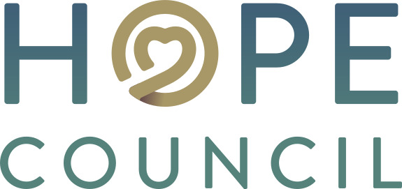
KENOSHA, Wis. — One of Kenosha County’s longest-serving nonprofit organizations has a new look, but the mission that has guided it for more than half a century remains unchanged. Hope Council recently unveiled a new logo and visual identity that leaders say better reflects the organization’s evolution while reaffirming its longstanding commitment to helping individuals, families, and communities navigate substance use, recovery, prevention, and life’s many challenges.
The rebranding marks the first major visual update for the organization in years and comes as Hope Council continues expanding its role as a comprehensive community resource. While many residents have historically associated the nonprofit with alcohol and drug education, today’s Hope Council provides a broad continuum of services that includes prevention education, intervention, treatment navigation, recovery support, diversion programming, family services, testing, community training, and connections to local resources.
Executive Director Michelle Sandberg said the new identity was carefully designed to communicate the values that have defined Hope Council since its founding.

“Our new brand is much more than a new logo,” Sandberg said. “It reflects the heart of our organization and the people we have the privilege of serving every day. My hope is that every person in Kenosha County who sees our new brand knows Hope Council is a place where they will be welcomed, supported, and treated with dignity.”
At the center of the new logo is a heart integrated into the letter “O,” representing compassion, healing, and human connection. Surrounding the heart is a circular design intended to symbolize unity and the belief that no one should have to face life’s challenges alone. According to Hope Council, every element of the design was chosen intentionally to tell the story of an organization built on connection, understanding, and hope.
The organization’s new color palette also carries symbolic meaning. Deep blue reflects trust and stability, qualities Hope Council says it has earned through decades of serving the community. Teal represents growth, healing, and connection, while muted gold symbolizes hope and resilience. Soft gray was selected to convey dignity, balance, and compassion. Together, the colors are intended to create a welcoming and professional identity rooted in community care.
Hope Council traces its roots back to 1968 and has spent more than 55 years serving Kenosha County residents. Throughout that time, the organization has worked with individuals seeking help for substance use, families looking for support, young people participating in prevention programs, court-referred clients, schools, employers, healthcare providers, and numerous community organizations.
Today, Hope Council describes itself as a place where people can seek assistance without fear of judgment. Whether someone is ready to begin recovery, supporting a loved one, complying with a court referral, or simply looking for reliable information, staff members emphasize listening first and helping people identify practical next steps based on their individual circumstances.
The nonprofit says that philosophy of meeting people where they are has remained constant even as its services have expanded over the decades.
“Through every chapter, our mission has remained the same: to meet people where they are with compassion, dignity, and hope,” the organization states in announcing its new brand.
Hope Council leaders say the updated branding also reflects the organization’s desire to remain relevant and accessible as community needs continue to evolve. The refreshed look will gradually appear on the nonprofit’s website, educational materials, social media platforms, printed publications, and throughout Kenosha County.
Despite the visual changes, Sandberg emphasized that residents should expect the same commitment that has defined Hope Council for generations.
“This is more than a new logo,” Sandberg said. “It’s a renewed commitment to the people of Kenosha County to support healthier lives, stronger families, and a more connected community.”
As Hope Council enters its next chapter, organization leaders say they hope the new brand serves as a reminder that help is available and that no one has to navigate addiction, recovery, or other life challenges alone. While the logo may be new, they say the organization’s purpose remains exactly what it has been for more than five decades: providing hope, healing, and connection to anyone who walks through its doors.
























One Response
These people are crazy and treat clients badly, especially if you are there by court referral. If you are given a court referral, find out if you can choose your own place to go, and go somewhere other than Hope Council. Any licensed substance abuse counselor can conduct an assessment that should satisfy the court. Check with your lawyer and go elsewhere if you can.